How we did it.

V&V

Real Estate
Advertising

Victory and Venture is a four-storey, 82-unit low-rise condominium development by The Providence Group, located at 609 Fourth Avenue NE in Calgary's Bridgeland neighbourhood, one of the city's most walkable and sought-after inner-city communities. With two-bedroom, two-bathroom units priced between $325,000 and $375,000 and a Discovery Centre on 12th Avenue SE, Victory and Venture needed print advertising that could cut through a crowded Calgary condo market and make a lasting impression on a buyer who had seen every floor plan graphic and lifestyle render in the category. Blair and Co. wrote and art directed the ad that did it.

Real estate development marketing brochure open spread with floor plans — Blair and Co. print advertising
The Victory and Venture product story was genuinely strong: space-savvy, open-concept two-bedroom and two-bathroom condos in Bridgeland at a price point that represented real value in the inner-city market. The challenge was not the product. The challenge was the advertising environment. Calgary condo advertising at the time defaulted almost universally to exterior renders, feature lists, and price-per-square-foot headlines. Buyers in the target demographic, young professionals and first-time buyers who were drawn to Bridgeland for its walkability, restaurant scene, and proximity to the river pathways, were visually sophisticated and easy to bore. The vision was an ad that rewarded the intelligence of that buyer by being genuinely funny and conceptually sharp, rather than showing them another building render they would not remember by the time they turned the page. The Hey, 1968 called creative concept used the retro television as a prop to make a pointed observation about the state of condo floor plan design, positioning Victory and Venture as the modern, intelligent alternative to layouts that had not evolved since the late sixties.

Methodology

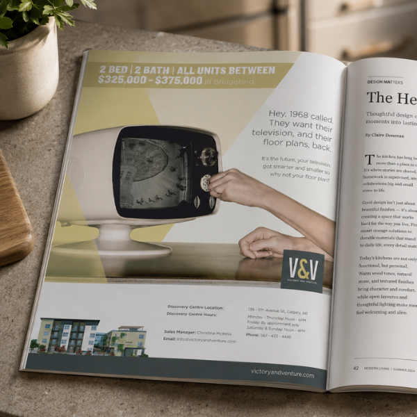
Blair and Co. developed the Victory and Venture print campaign around a single creative insight: the open-concept, space-maximizing floor plans that Victory and Venture offered were the antithesis of the cramped, compartmentalized layouts that have plagued the condo category for decades. That insight led directly to the Hey, 1968 called concept, using an image of a retro 1960s television set as the visual vehicle for a headline that was sharp enough to make a reader laugh and considered enough to make them pause. The body copy extended the concept cleanly, drawing a parallel between the way televisions got smarter and smaller over the decades and the way floor plans should have done the same. The retro television image gave the ad a stopping power that no building render or lifestyle photography could match on the page, while the concept itself communicated the product differentiator, smart, modern, space-efficient layouts, without resorting to a specification list. The V and V monogram mark was used to anchor the brand in the ad without overpowering the creative concept. The Discovery Centre details, location, hours, sales manager contact, and website, were carried at the base of the ad in a clean information panel that gave motivated buyers everything they needed to take the next step.

Process

Blair and Co. developed the concept and copy from the campaign brief, presenting the Hey, 1968 called direction as a single strong idea rather than multiple options. The headline and body copy were developed together, with the conceptual logic built to carry clearly from the image through the headline to the payoff in the body copy without requiring the reader to work for it. The retro television photography was sourced and art directed to produce a visual that felt deliberately period and slightly absurd in a way that complemented the tone of the headline without being cartoonish. The layout was built to handle the premium magazine format, with the image taking the dominant visual position and the headline and body copy given enough space to breathe and be read properly. The ad was prepared to full-page magazine print specification and delivered press-ready for placement in Modern Living and other Calgary lifestyle publications reaching the inner-city buyer demographic.

Outcome

The Victory and Venture Hey, 1968 called campaign gave the project a distinctly memorable print presence in the Calgary condo advertising market, standing out by doing the opposite of what the category expected. The conceptual sharpness of the headline and the visual surprise of the retro television gave readers a reason to stop on the page and engage with the ad rather than turning past it, while the body copy paid off the concept in a way that communicated the product benefit clearly without losing the wit that made the ad worth reading. The campaign reinforced the Victoria and Venture positioning as a smarter, more considered alternative in the Bridgeland inner-city condo market.

Skills Used

  • Magazine Print Advertising
  • Creative Concept Development
  • Copywriting, Art Direction
  • Campaign Strategy
  • Conceptual Advertising
  • Retro Photography Art Direction
  • Typography, Condo Presale Marketing
  • Inner-City Real Estate Advertising
  • Print Production
  • Full-Page Magazine Specification
  • Brand Identity Application

Same Day Quote

Time matters. Tell us what you need, we’ll book a quick call, and once the scope is clear, you’ll have a same-day quote.

More case studies

Real results for construction and trades businesses across Calgary and Western Canada. Our case studies show how SEO, Google Ads, and clear brand positioning work together to generate consistent inquiries, improve visibility, and bring in better projects. Each example breaks down how we build marketing systems that attract the right clients, reinforce credibility, and support steady, long-term growth for contractors and trades companies.
Research

//

Salesmatic
Research

//

Salesmatic
Brochures & Collaterals

//

Geib and Co

Take a look at more of our advertising work.

We create brand experiences that stay with people, not just pass in front of them.

It starts with understanding what actually makes your product valuable and where that intersects with what your customers care about. From there, we build messaging that lands clearly and consistently across every channel.

The outcome is simple. More qualified leads. More sales. And every once in a while, work that gets recognized for doing it right.

Colorful abstract brand identity design and marketing creative — Blair and Co. advertising agency
Advertising
True North Railings
Rock and Roll themed real estate marketing print advertisement — Blair and Co. creative advertising Calgary
Advertising
Sterling Homes
Soundmark real estate marketing magazine advertisement — Blair and Co. print advertising agency
Advertising
Riversong
Real estate development marketing brochure open spread — Blair and Co. creative services Calgary
Advertising
Douglas Homes
Real estate marketing single page magazine spread — Blair and Co. print advertising agency, Calgary
Advertising
V&V
Southfork real estate marketing full-page magazine advertisement — Blair and Co. print advertising
Advertising
Southfork
How We Do Home Theatre retail print advertising campaign — Blair and Co. advertising agency Calgary
Advertising
Sterling Homes
Advertising
LiFTT
Real estate development marketing brochure open spread — Blair and Co. print creative services Canmore
Advertising
Canmore Renaissance
Real estate rooftop development print advertisement — Blair and Co. advertising agency Calgary Edmonton
Advertising
V&V
Real estate development marketing brochure and collateral design — Blair and Co. creative services
Advertising
V&V
Mozaic real estate development outdoor signage advertising — Blair and Co. signage and real estate marketing Edmonton
Advertising
Mozaic