How we did it.

Pathway

Small Business
socialmedia

Pathway Hockey is a Calgary-based hockey tournament and events organization built around a simple belief: the game should be memorable. Running competitive events including the Pathway Origins open tournament, Pathway Versus for female players, and the 3v3 World Cup, Pathway needed a social media presence that matched the energy and ambition of the events themselves. Blair and Co. designed and produced the social media creative suite that turned the Pathway Hockey Canada Instagram feed into a bold, consistent, and recognisable hockey brand.

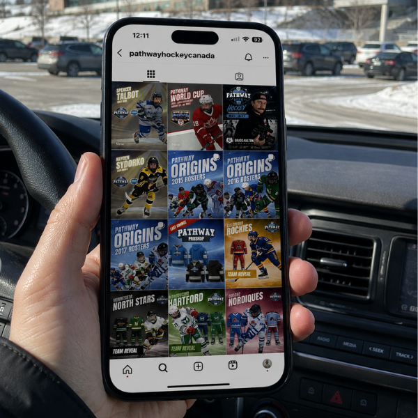
Pathway Hockey Series was created to give players and their families a better experience than the standard tournament circuit, more affordable, higher value, and built around meaningful competition, development, and the moments players remember for years. The organization runs multiple event formats across Calgary, including the Origins open tournament for birthyears 2015 through 2019, the Versus female event for U13 and U15, and the flagship 3v3 World Cup held annually at Trico in Calgary. The social media creative needed to build awareness and excitement for each event series, drive registration, announce rosters and team reveals, and promote the Pathway Pro Shop. The brand also needed to introduce and celebrate individual players, coaches, and the community that makes Pathway distinct from a standard hockey tournament. Every post needed to look like it belonged to a legitimate, professional hockey property, the kind of brand that players and families want to be associated with and share on their own feeds.

Methodology

Blair and Co. developed a visual system for Pathway Hockey Canada that could support the full breadth of content the organization needed to produce across an active event calendar. Team reveals for franchises like the Alberta Rockies, Minnesota North Stars, Quebec Nordiques, and Hartford were designed to feel like real franchise announcements, with strong colour identities, bold player photography, and dynamic typography that gave each reveal the weight of an actual team launch. The Origins roster series for 2015, 2016, and 2017 birthyears was designed as a structured content sequence, with each year’s roster drop carrying a consistent but distinct visual identity that built anticipation and gave the audience a reason to follow across multiple posts. Player features including Spencer Talbot and Nevena Sydorko were given spotlight-quality graphic treatments that elevated individual athletes within the Pathway community. The Pro Shop content was designed to extend the event brand into merchandise in a way that felt cohesive with the tournament creative rather than a separate retail channel dropped into the feed.

Process

Blair and Co. established the visual framework for Pathway Hockey Canada before individual posts were produced, building a template architecture grounded in the brand’s core palette and typographic identity. This system allowed the Pathway team to generate a high volume of content across multiple event series, team announcements, roster reveals, and player features without losing visual consistency or production quality across the feed. Each content type, from tournament event graphics to team colour-blocked reveal cards to individual player features, was designed within a shared grid and typographic hierarchy that made the full Instagram feed read as a single coherent brand. The World Cup, Origins, and Versus events each received distinct but related creative treatments that gave each series its own identity while keeping the overall Pathway brand recognisable across all content.

Outcome

The Pathway Hockey Canada Instagram feed built into a visually consistent, high-energy hockey brand that communicates the professionalism and ambition of the organization and its events. The creative system gave the Pathway team the tools to produce event announcements, team reveals, roster drops, player features, and Pro Shop content at the pace a growing hockey organization requires, without the output suffering in quality or consistency. The bold, sports-broadcast-influenced graphic style gave Pathway a social presence that stands out in a crowded youth hockey market and reflects the experience the organization delivers on the ice.

Skills Used

  • Social Media Creative Direction
  • Visual Brand System Development
  • Graphic Design, Sports Graphic Design
  • Tournament Event Creative
  • Team Identity and Colour System
  • Roster Reveal Series Design
  • Player Feature Design
  • Merchandise and Pro Shop Creative
  • Template Architecture
  • Instagram Feed Strategy
  • High-Volume Content Production
  • Campaign Series Design

Same Day Quote

Time matters. Tell us what you need, we’ll book a quick call, and once the scope is clear, you’ll have a same-day quote.

More case studies

Real results for construction and trades businesses across Calgary and Western Canada. Our case studies show how SEO, Google Ads, and clear brand positioning work together to generate consistent inquiries, improve visibility, and bring in better projects. Each example breaks down how we build marketing systems that attract the right clients, reinforce credibility, and support steady, long-term growth for contractors and trades companies.
websitedesign

//

Tech-Wood
Branding

//

Canmore
Advertising

//

True North Railings

Take a look at more of our socialmedia work.

We create brand experiences that stay with people, not just pass in front of them.

It starts with understanding what actually makes your product valuable and where that intersects with what your customers care about. From there, we build messaging that lands clearly and consistently across every channel.

The outcome is simple. More qualified leads. More sales. And every once in a while, work that gets recognized for doing it right.

No data was found