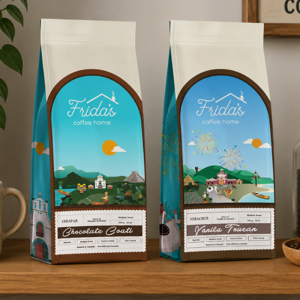
Blair and Co. developed a packaging illustration system that gave each regional blend its own visual world within a consistent structural framework. The arched label panel at the front of each bag was treated as a window into the region the coffee came from, with a full illustrated landscape scene unique to each blend. The Chiapas bag depicted a coastal church, rolling green hills, tropical wildlife, a coati, and the warm golden sun of southern Mexico. The Veracruz bag captured the celebratory energy of the region with fireworks, a waterfront village scene, tropical birds, and the festival atmosphere that defines the culture of that coastal state. Both illustrations used a warm, folk-art-influenced palette of sky blue, tropical green, earthy brown, and golden sun tones that felt authentically rooted in Mexican visual culture without being a pastiche of it. The Frida’s Coffee Home logo, rendered in clean white script, anchored the top of the arched label on both bags, with the regional name, blend name, roast level, weight, and grind guide set in a structured panel below the illustration. The overall effect was a bag that communicated premium specialty coffee credentials and genuine cultural storytelling in the same design.